Lush
Drawing on a 90’s aesthetic.
This is a wellbeing toolkit & Packaging design for a festival.
The goal of this project is to develop a functional design for Lush that aligns with festival venues and reflects the brand’s values and products.
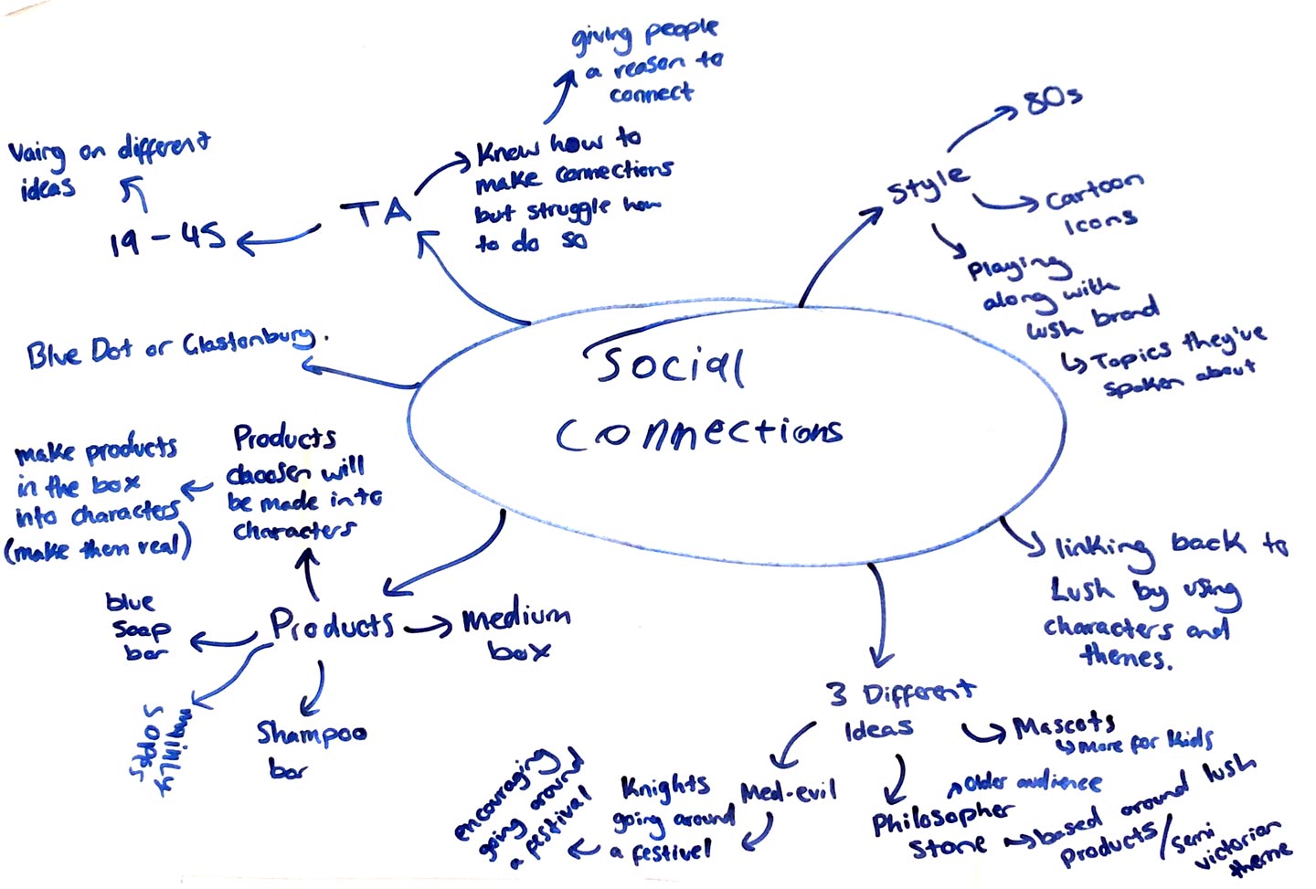
A key consideration in my design process was understanding the users and how my designs could support them within the selected project theme: Social Connections. Through research, I gained deeper insight into Lush consumers and their preferences.
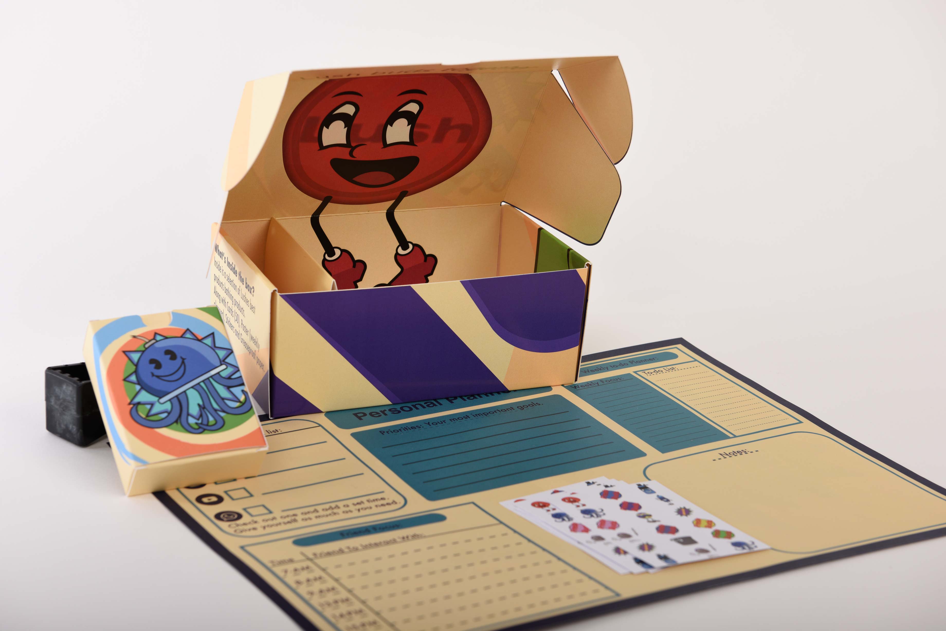
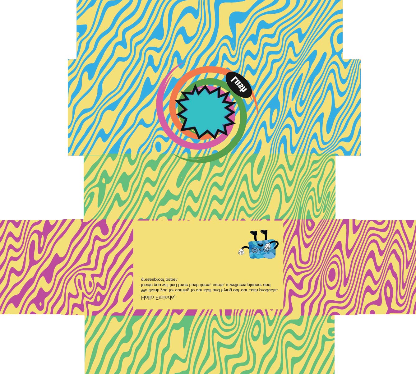
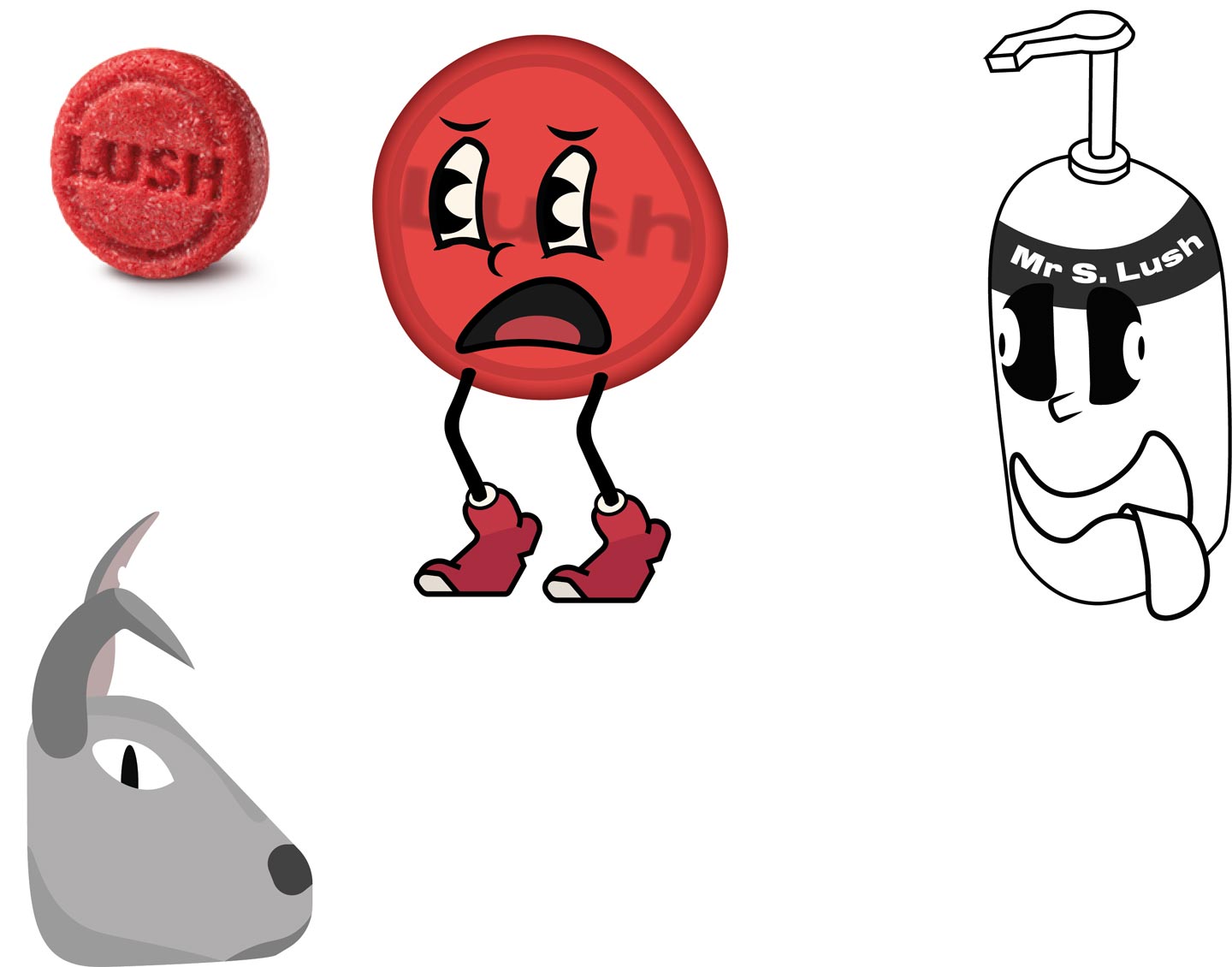
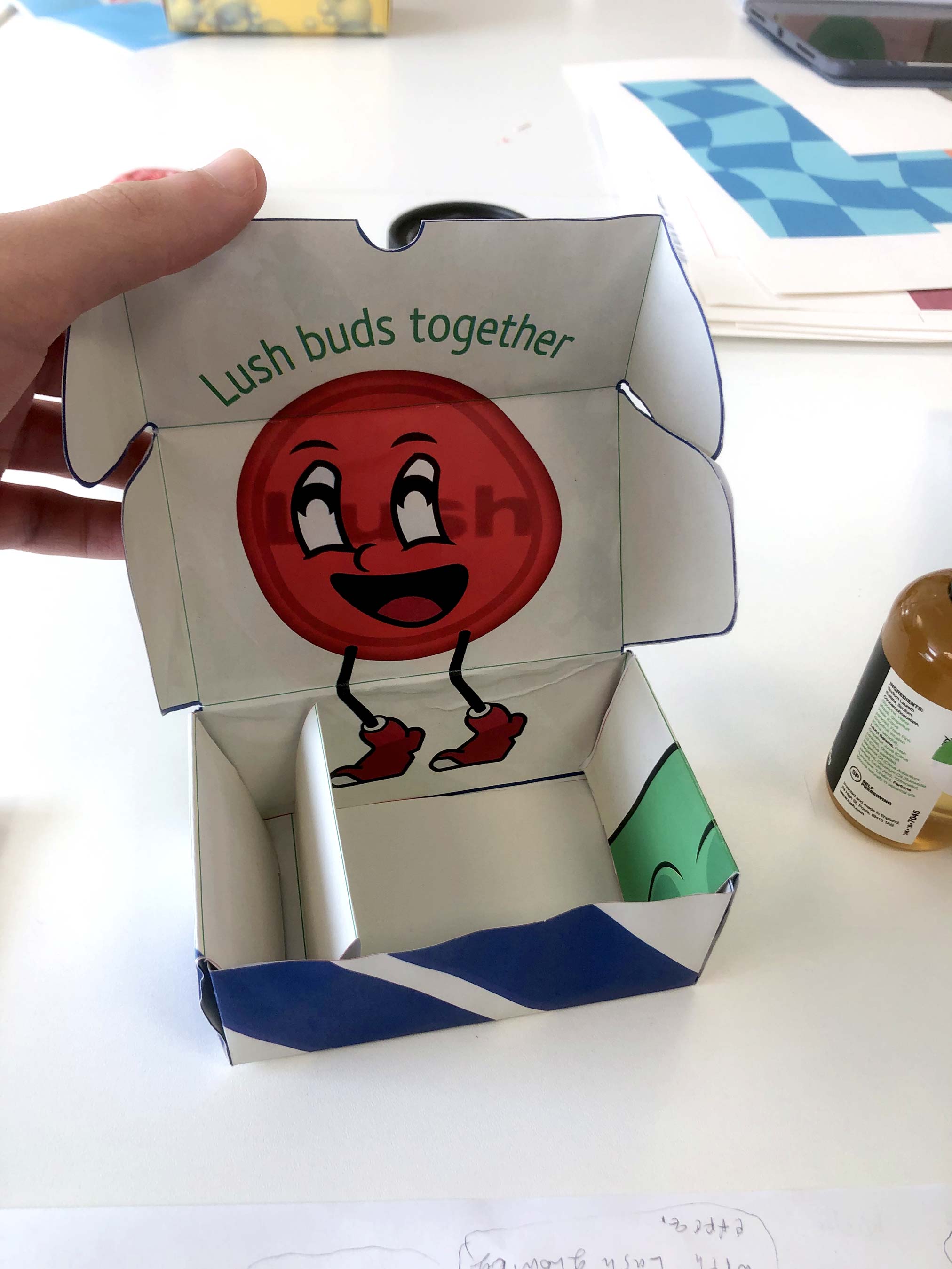
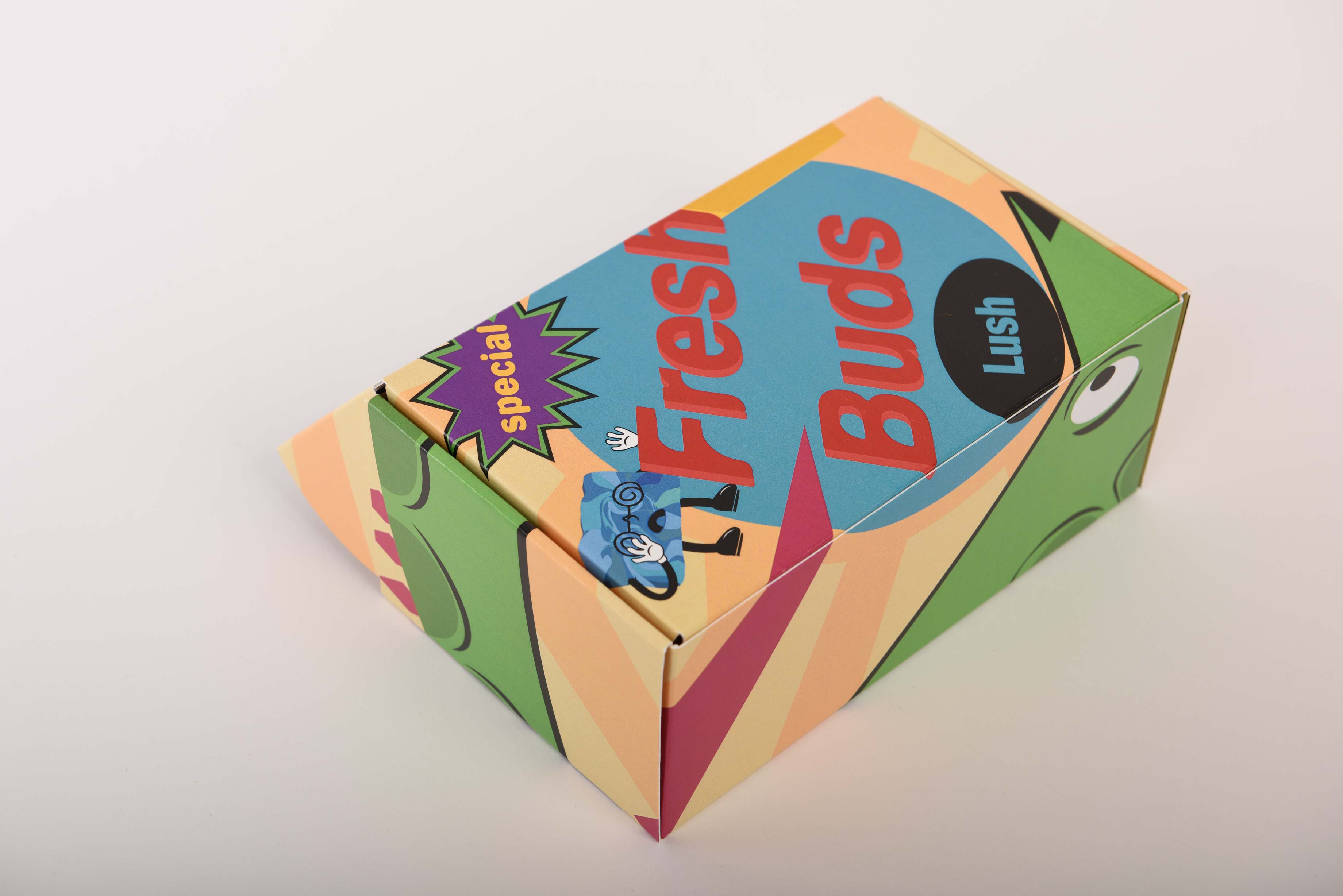
To meet Lush’s standards and fulfil the brief, we were required to develop three potential design routes for Lush packaging. Out of the three concepts I created, I chose to go with Route 2, a 90s-inspired design that pays homage to Lush’s early works and brand origins that I called Lush Buds.
Lush throw back.
In addition to packaging, our toolkit needed a clear and meaningful purpose for users. I developed Route 2 (Lush Buds) to help users strengthen their social connections. This final concept aims to ease social anxiety by encouraging positive physiological responses and offering engaging activities.
The toolkit is designed to reduce the stress and pressure often associated with social interactions. It achieves this through fun, approachable characters and simple tasks that help users open up and build connections more comfortably.
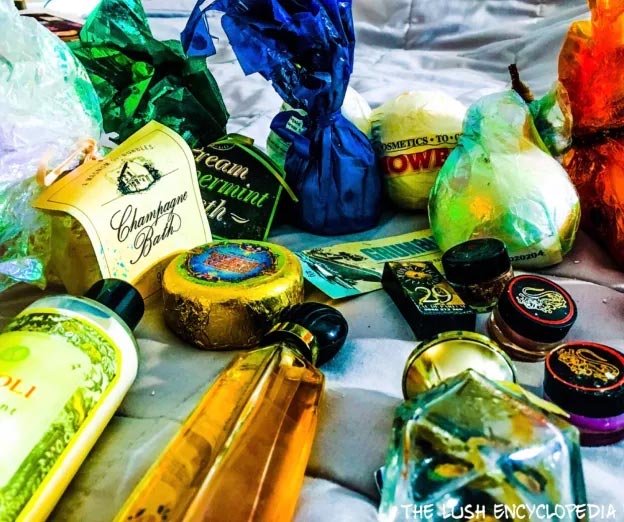
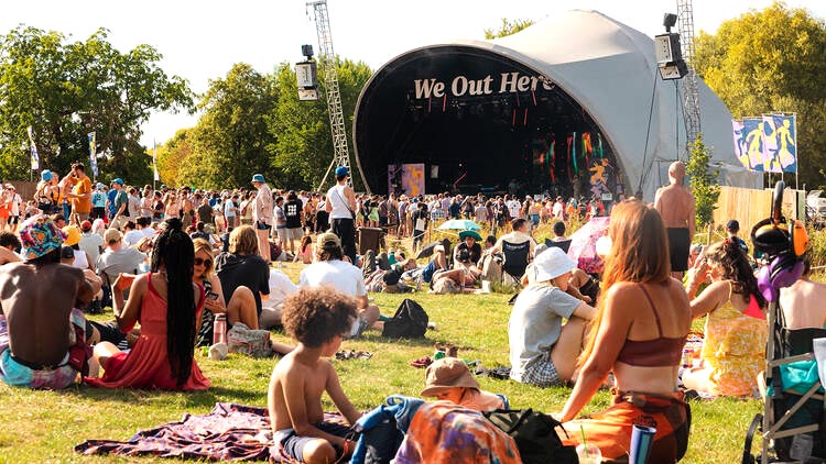
Based on my personal experience attending festivals such as 'We Out Here' and 'Glastonbury,' I have gained a strong understanding of the types of stands typically set up at these events. This insight has enabled me to refine and enhance my Lush box and products, ensuring they are better suited to the needs of festival-goers.
Development.
My early box prototypes underwent several adjustments after realizing that the design didn’t fully align with Lush’s overall branding.
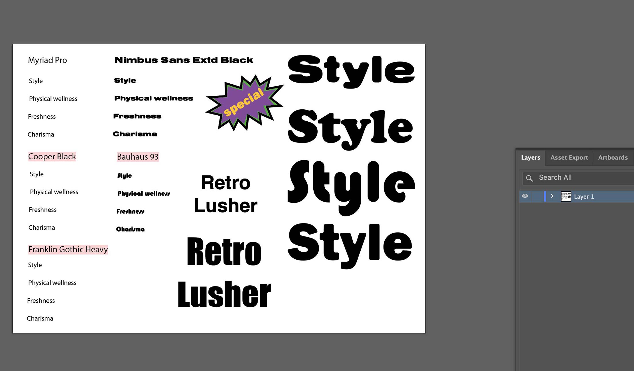
Based on tutor feedback, I found that the design appeared slightly too childlike. To refine it, I made strategic changes to the color palette and introduced new character illustrations for the box.
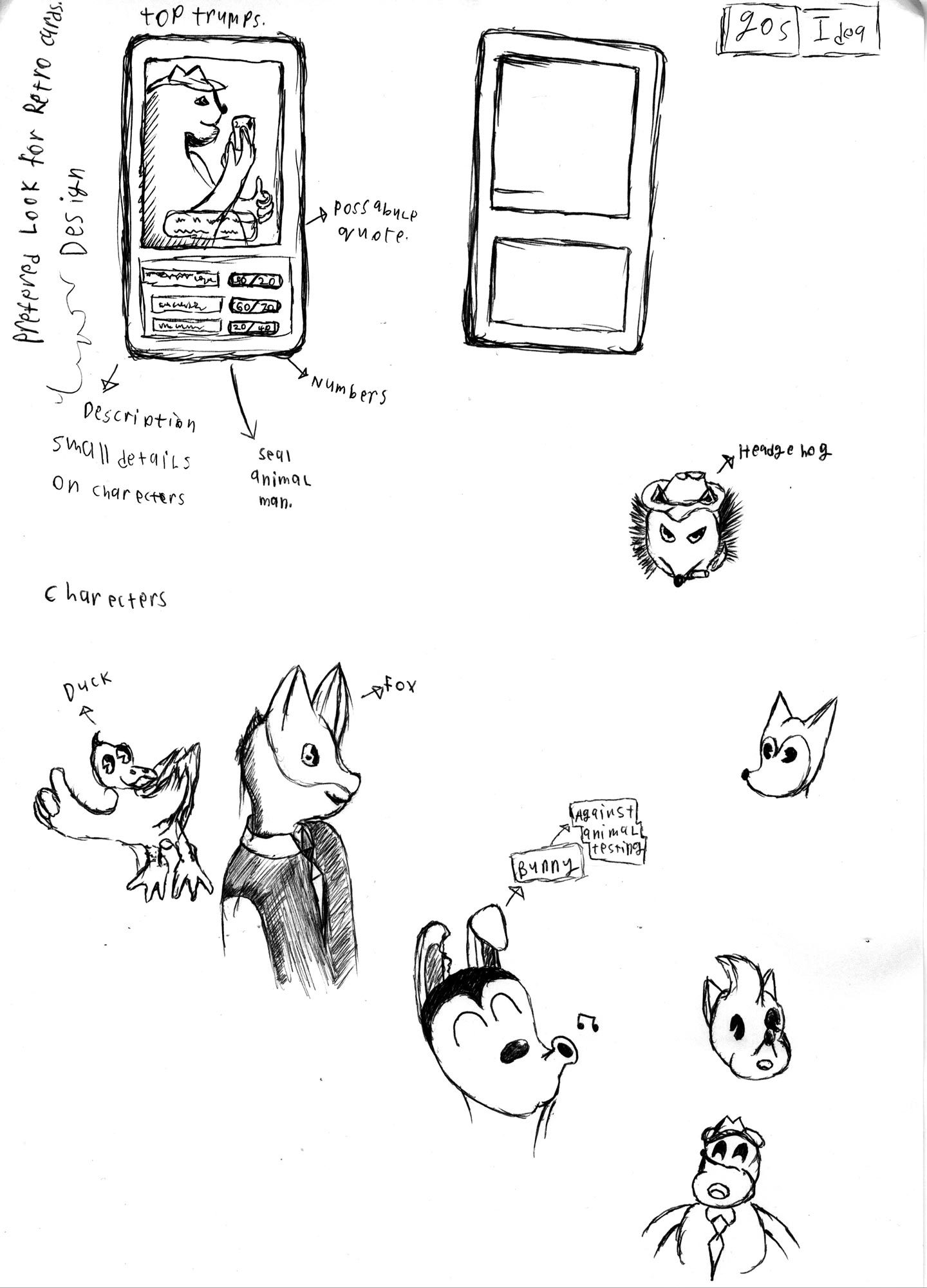
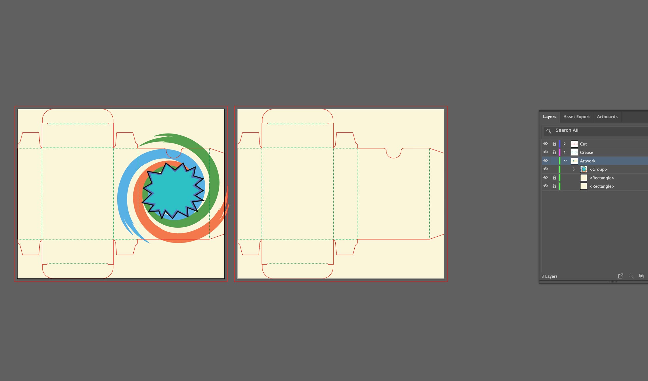
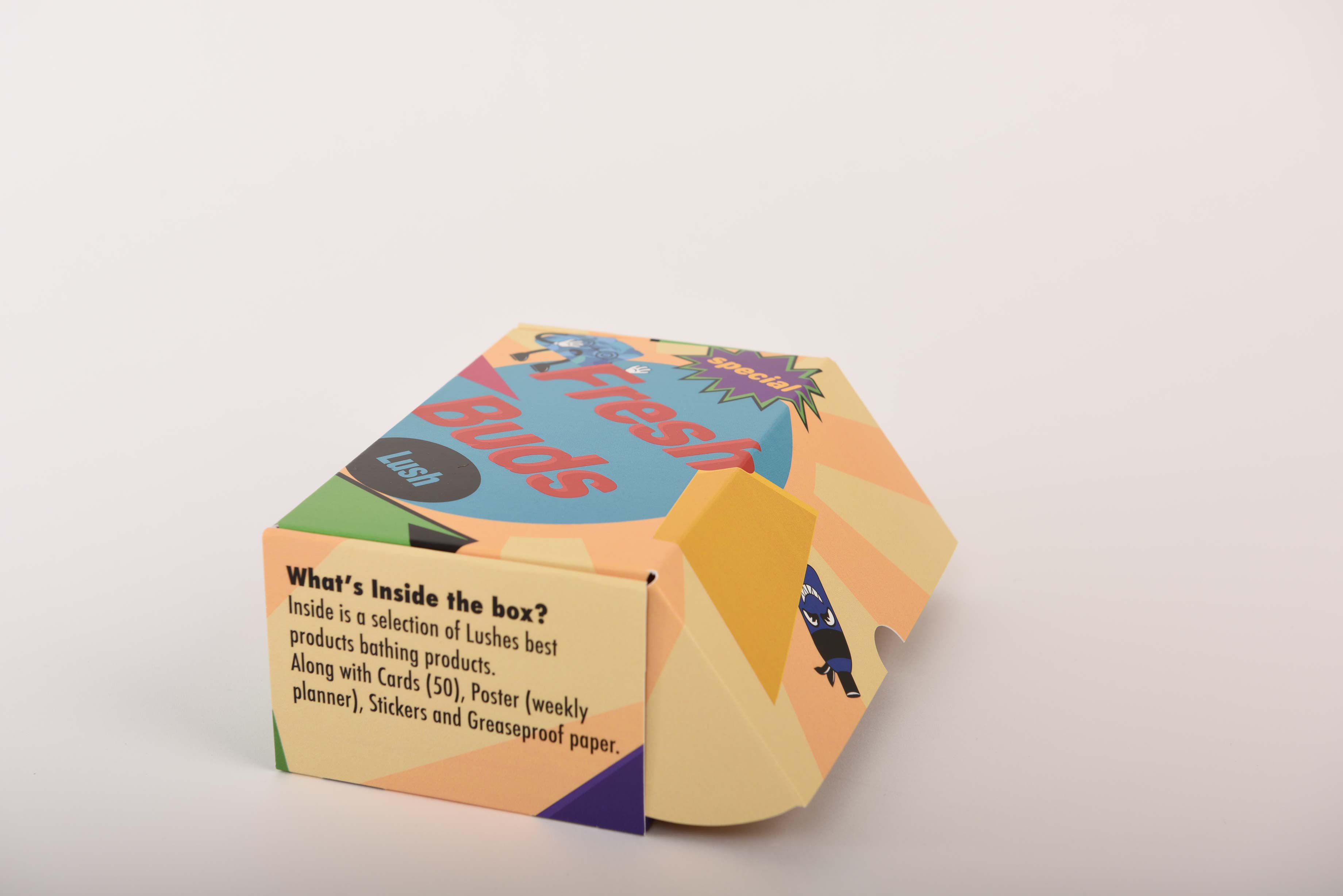
One key feature of the design is a Top Trumps-style game, where each character has unique personal traits. This element makes it easier for users to relate to the game while also encouraging social interaction. The goal was to create an enjoyable experience that naturally fosters engagement between players. The card box itself maintains a relatively simple design, incorporating the refinements I made.
Ideally, I would have liked to add more details, such as a background pattern to better integrate with the overall imagery. However, due to time constraints and printing deadlines, some elements had to be omitted.
The Routes
My other routes for development.
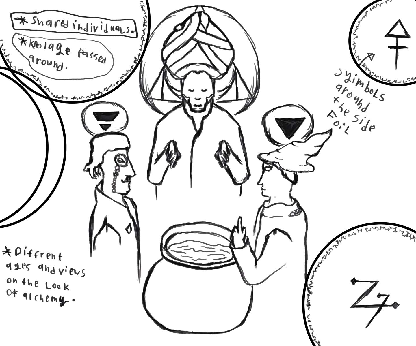
Route 1:
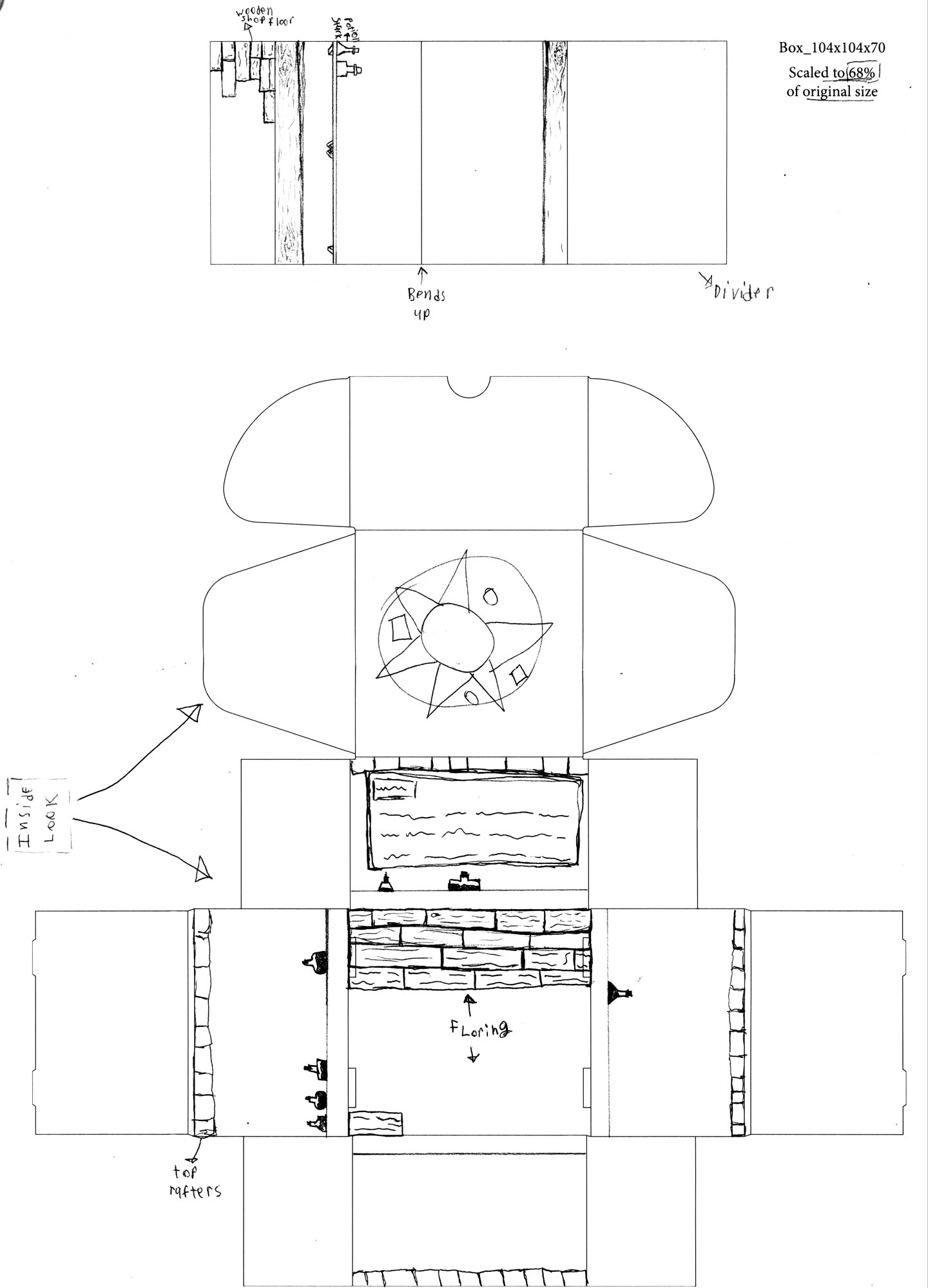
For the Phlushipher Stone concept in Route 1, I planned to create a stylized font for the title. I drew inspiration from Norse runes and Egyptian script to develop a typeface that visually connects to the themes of alchemy. My goal was to convey the ancient origins of alchemy and its deep historical significance.
In my sketches, I aimed to highlight the symbolic and esoteric aspects of alchemy, as these elements are likely to intrigue viewers of the box. This section was designed to illustrate alchemy’s gradual evolution into a more scientific discipline. To represent this transition, I planned a depiction of three individuals from different historical periods standing around a bubbling cauldron.
I wanted alchemy to be perceived as an early stage of science, so I incorporated facts and figures to serve as logical touchpoints for users. Meanwhile, the spiritual side of alchemy would be represented through the old sage archetype, reinforcing its mystical roots.
Route 2:
The idea I chose to further develop (Route 2) featured a visually striking 90s-inspired design that paid homage to Lush’s early works and origins. This tribute to Lush’s founding incorporated layered textures to give the artwork a vintage feel. I also utilized colors from their original product lines to design both the box and the accompanying cards, ensuring a strong connection to the brand’s history.
My early-stage designs were held-up due to me developing a card game along with the three other pathways. This issue was caused by my route 2 overly large concept that conflicted with my limited time frame.
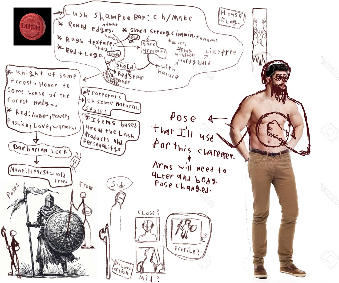
Route 3:
My concept revolved around Monster-Hunting Lush Knights. Each knight was designed as a Lush product, with their appearance and characteristics reflecting the look and purpose of the items inside the box. The creature depicted on the packaging symbolized negative thoughts, while the Lush Knights boldly represented cleansing and renewal.
Towards the end of the project, I had to make several adjustments to many of the Lush characters. Additionally, I realized that the card game I was developing could not be fully completed due to the need for multiple character designs. With the limited time remaining, I had to make a strategic decision by focusing solely on completing the game would have caused other aspects of my project to suffer.
In the end, I chose to prioritize finalizing my Lush box, toolkit, and side products to better represent my ideal final outcome.
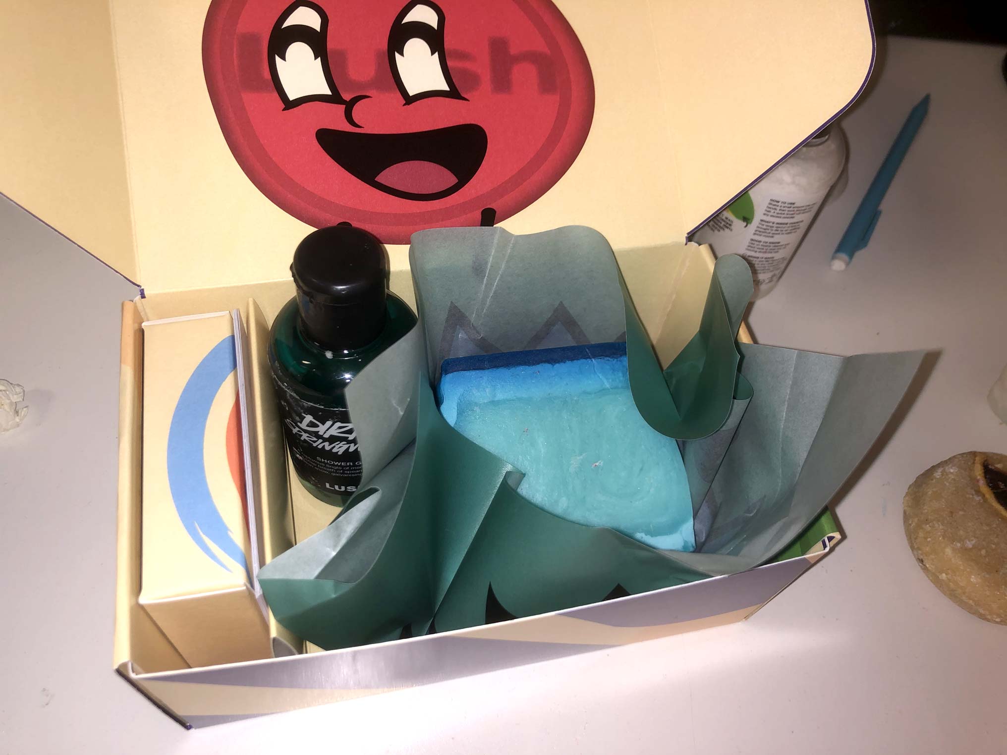
My experiments with box sizes and Lush items helped me determine the best arrangement for the toolkit’s contents. Testing various Lush boxes allowed me to properly size my selected items. However, even with my chosen products and the demonstration items provided by Lush, I found that the fit was slightly tight.
While this snug fit helps prevent items from shifting during transport, it also presents a challenge—if a selected Lush product is too large, it may not fit properly within the box. This variation in product sizes required careful consideration in my final design.
Final outcome:
Final Reflection:
With this box, my goal is to encourage users to personalize the available space. Along with the stickers, the box offers an opportunity for users to add Lush characters that best represent them, allowing them to showcase their individuality. This simple activity aims to inspire self-expression and boost confidence.
Considering the brief and Lush's preferred requirements, I designed the box with the intention of fostering a deeper connection with the audience. To meet these objectives, I focused on incorporating elements that encourage users to express their personal traits by attaching items from inside the box. This approach helps users form a stronger bond with the Lush products and connect with the contents more meaningfully. Additionally, blank areas on the box are included to encourage the use of stickers, further enhancing its personalized appearance.
With these changes I believe my Kit has met the project requirements. Effectively demonstrated a clear connection to Lush and their colorful nature as a whole through the use of my box's playful nature and clear 90s color plate.
View Bibliography
---Back to Work page---